Last Week’s Comics 12/2/2015
Ringside #1
(Image— Writer: Joe Keatinge, Art: Ni
ck Barber, Colors: Simon Gough)
There was a point in my life where reading comics and following the world of professional wrestling were at the same level of importance. In the late 80’s and early 90’s the two worlds shared many things in common, as the WWF pushed a roster of colorful and cartoony characters and WCW utilized classic wrestling writing to push the plotlines of a stable of plain to insane wrestling talent. The Ultimate Warrior himself may as well have stepped out of comic drawn by Rob Liefeld with his ‘roided up proportions! It’s interesting that, 25 years later, Image 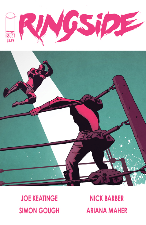 Comics is now publishing a comic book based on what goes on behind the scenes of a fictional professional wrestling world. Instead of ‘roided out cartoons it’s an entertaining look at the somber and dangerous lives that wrestlers lead.
Joe Keatinge, Nick Barber and Simon Gough use this issue to introduce us to this world. We mostly follow Dan Knoussos in this issue, a middle-aged man who once wrestled as a popular character known as The Minotaur for one of the big wrestling companies. Knoussos has been training wrestlers in Japan for some years, most likely the result of a major falling out he had with the company. He wants nothing to do with being in the ring anymore, nor does he want anything to do with the character that made him famous, possibly because he never became famous and is now making no money for his troubles.
There’s a scene where Nick returns to the states and reconnects with an old wrestling acquaintance named Andre who has used his former ring persona as a launching pad for his business. He tries to bring Nick into the fold and Nick out and out refuses, explaining that the company owns everything related to the character he used to play. It sums up where the man is at now, where a prosperous part 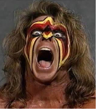 of his life is behind him, dead and buried. A shell of his former self, he tried to get as far away from that life as possible, but a friend in trouble brings him back to the states.
We are introduced to a number of characters in this issue who are sure to play a part in the bigger picture. Reynolds is a young wrestler who has an idealistic outlook on the industry and history of pro wrestling that is slowly shattering, as he’s relegated to wrestling undercard matches or sitting it out in the locker room. There’s also Dan’s friend Amy, a welcome female addition to the cast that will be helping Dan out on the dangerous quest he’s embarking on. Andre is the aforementioned older wrestler who has found some success post-wrestling. We are also partially introduced to some of the others involved in the major wrestling company, including an older “creative” guy whose scripts for the matches are being undermined by an opportunistic younger producer.
Keatinge adds many real-world details in this issue to really help flesh out this fictional wrestling  world. For instance when three of the men are at a diner Dan orders a burger with fries, much to the shock of the two active wrestlers who are on a training diet of chicken and vegetables. For the one wrestler that Dan knew from back in his days as the Minotaur you can see it in the way Nick Barber draws him that he realizes Dan’s not looking to get back into shape to step in the ring. There’s also the backstage hubbub at the beginning of the issue where we get snippets of the creative process that goes into a televised wrestling event. I hope to see more of these scenes, because the politics involved in what happens creatively on pro wrestling cards is fascinating to me.
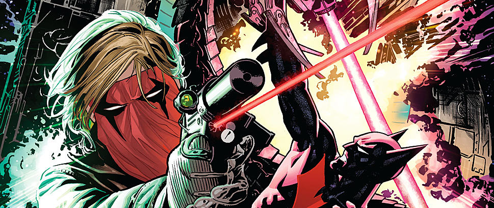
Nick Barber’s art is definitely going for a harder-edged look, with the coloring of Simon Gough becoming appropriately loud when necessary (anything involving in the ring wrestling), but also staying relatively muted when we follow Nick on his dark and lonely path. I get glimpses of Jason Latour’s work on Southern Bastards but also strangely echoes of Frank Miller’s Sin City art. I’m not 100% sold on Barber’s style because at times it’s a little too airy and out of focus where it’s hard to pin down characters and gravity, but that will probably gel as the series goes on. There’s some great details though, like a picture of Andre’s colorful Million Dollar Man-like former persona, Amy’s weapons locker and the reveal of Dan’s messed-up face after he’s beaten down by some mysterious antagonists.
I really enjoyed this issue and the setup that they creative team provided of this world. My only complaints really have to do with the art in some spots and the fact that they went the 100% fiction route with the series. Just from what the creative team writes in the back section of the comic reassures me that they’re marks who care about wrestling and about comics, and those details definitely shine through in the writing. Still, a Hip Hop Family Tree-style comic series about the real-world behind the scenes of wrestling would be amazing. I’m really curious to see how this series will pan out, as it seems like the ingredients are here to finally make a good pro wrestling comic book.
Michael Edwards
Dark Knight III: The Master Race #1
(DC— Writer: Brian Azzarello & Frank Miller. Art: Andy Kubert, Frank Miller & Klaus Janson. Colors: Brad Anderson & Alex Sinclair)
Dark Knight III: The Master Race is a cash grab. We all know that. It’s a sequel to one of the most influential and critically acclaimed comic books ever made. Calling DKIII anything else would be disingenuous. The previous Dark Knight Returns sequel, Dark Knight Strikes Again was a cash grab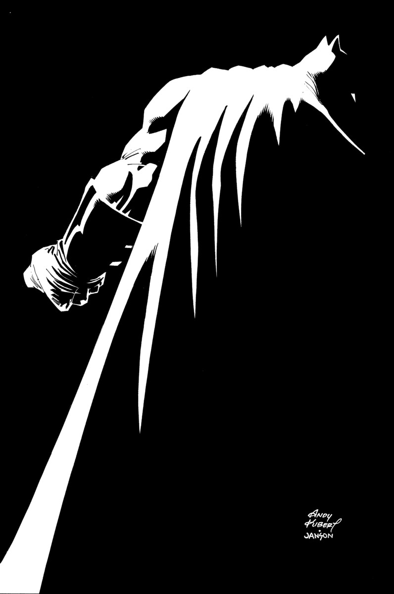 too (and it worked). DK2 had flair though. Frank Miller and colorist extraordinaire Lynne Varley had something to say with DK2 – for better or worse, they had an artistic vision. Unfortunately Dark Knight III has none of that panache.
Dark Knight III: The Master Race is uninspired and overpriced.
Dark Knight Returns is a seminal Batman comic. It’s on almost every top ten favorite Batman stories list. Heck, it’s in a lot of top ten comics of all time lists. As a sequel to DKR, it’s impossible to review DKIII in a vacuum. It has to stand next to the originality and clarity of creative vision that Frank Miller, Klaus Janson and Lynn Varley put into DKR. If the creators behind DKIII can’t be as original, they at least have to be as creative. Miller and Varley got hella experimental with Dark Knight Strikes Again.
Say what you will about DKSA, but at least that book is bold. Lynn Varley’s colors, scoffed at back in 2001 and 2002, wound up fostering an aesthetic seen in films like Drive and videogames like Hotline Miami. Dark Knight III looks like every other comic DC publishes. That’s probably the book’s greatest visual sin – it’s boring.
I like a lot of Andy Kubert’s work. His work with Grant Morrison on Batman & Son and his 1990s X-Men run are some of my favorite comics. He drew an issue of Ka-Zar where Ka-Zar had to fight Thanos in the Savage Land and it was awesome! When he’s doing his stuff, I’m all in. Here though, it just doesn’t look like the world Miller, Janson and Varley created. There’s no hint of the mutants or Batman’s revolution from DKSA. It looks like present day (or a few days ago, as Jon Stewart is still the host of the Daily Show in this comic). There’s nothing innovative about the panel structure. It’s no different from any $2.99 and $3.99 comic on the 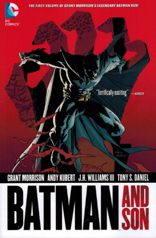 stands.
There are 28 story pages and a 12 page mini comic inside. It has more story pages than the average comic book. That said, $5.99 still feels too steep, especially considering this is a comic DC advertised on The Howard Stern Show.
There are two parts of this comic that I do genuinely like. The first one is a scene where Wonder Woman battles a minotaur while caring for her (and presumably Superman’s) infant son. It’s Andy Kubert doing his thing and Brian Azzarello writing a badass Wonder Woman. It’s a fun sequence with some gorgeous South American set pieces. It’s Amazons in the Amazon. Get it? Bad joke aside, it’s an exciting bit that ends with Wonder Woman nursing her son.
The other scene I like is the Atom mini comic. It’s placed in the middle of the comic, which is weird because it actually takes place after the last page. Frank Miller and Klaus Janson take the opportunity to draw a fun Atom comic where Ray Palmer fights a mini-dinosaur while lamenting his divorce. Alex Sinclair’s colors don’t do the art many favors. Miller’s impressionistic style looks terrible with such a safe and house style approach to coloring.
Even when this comic manages to be interesting, it still drops the proverbial ball.
Do you want to read a good Batman comic? Scott Snyder and Greg Capullo put one out every month. It’s called Batman. Dan Brereton is drawing a story in the latest issue of the digital first series, Legends of the Dark Knight. Batman & Robin Eternal is pretty damn entertaining too.
Better yet, read something different like Ringside or one of the hundreds of other comics out there. Skip this overpriced cash grab.
Ian Gonzales