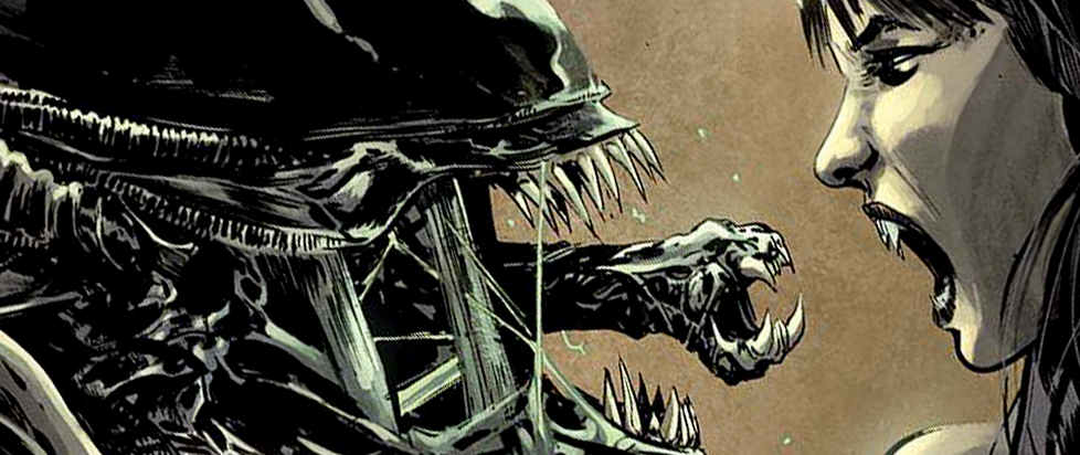
Last Week’s Comics 4/8/2015
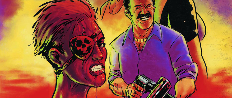
Space Riders # 1
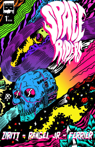 Black Mask Studios – Writer: Fabian Rangel, Jr. Artist: Alexis Ziritt
Part Jack Kirby, part EC Comics and part Heavy Metal – Space Riders # 1 is batshit insane (and I mean that in the best possible way)! It’s the kind of psychedelic ride you don’t generally see in comics all that much anymore. It feels like a lost gem of the Bronze Age, Space Riders reminds me of Kirby’s 2001: A Space Odyssey adaptation. The only books on the market I could compare it to are Captain Victory and the Galactic Rangers and Transformers Vs. G.I. Joe (two of my absolute favorite books around – they’re bonkers).
Space Riders is a surreal soap opera about Capitan Peligro and the crew of his skull shaped spaceship, the Santa Muerte. Rangel and Ziritt’s work is a love letter to sci-fi comics. There are nods to all kinds of sci-fi, from Star Wars to 2001 sprinkled throughout. Capitan Peligro is a hard drinking, down and dirty fighter. His crew consists of a sexy lady robot and a baboon first officer with anger management issues. Together, their mission is to mete out punishment to the criminal denizens of outer space.
The first issue sets the stage with a trippy and inspired double page splash. Ziritt’s art conveys a universe of unlimited twisted imagination. It’s an epic space battle in which the Capitan loses an eye while fighting a scumbag named Hammerhead outside the Santa Muerte. Ziritt’s work and Rangel’s script flow together to tell what starts as a simple tale of a starship captain meeting his new crew and gong on a new voyage. It’s a smart set-up though, taking the crew through the Vortex of Madness (which reminded me of that weird wormhole scene in Star Trek: The Motion Picture). The Vortex lives up to its name as it drives all the ship’s crew insane while they’re inside it. It’s a damn hoot!
Space Riders is structured accessibly. It’s full of mind bending concepts. but Rangel and Ziritt focus on building their main character first. Capitan Paligro is our eye into this bizarre universe. It looks like Rangel and Ziritt have a helluva ride planned for us and I can’t wait to see where Space Riders goes!
Ian Gonzales
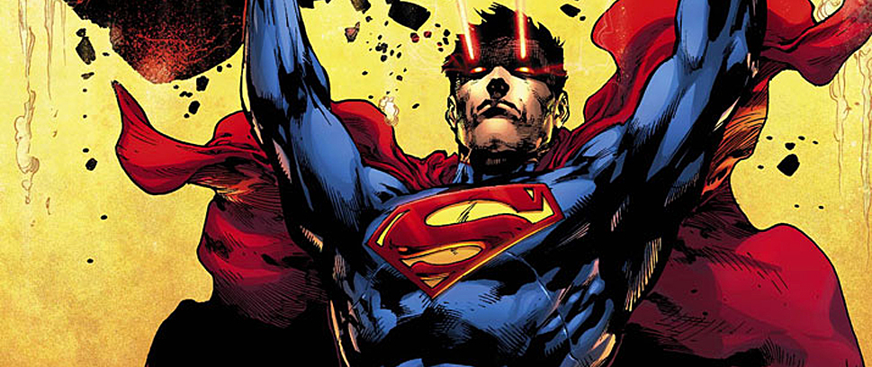
Convergence #0
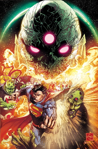 DC Comics Writers: Dan Jurgens & Jeff King. Artist: Ethan Van Sciver
I don’t really know where to begin this review. I was hoping that Convergence #0 would bring some semblance order to the enigmatic event DC has been teasing for a while now. How is this different than any of the “Crisis” events that preceded it? How does it play in to Future’s End, the New 52, or the rest of the DCU for that matter?
The answers to these questions go unanswered as DC’s lead in to its next event is cumbersome and opaque, relying more on confusing the reader with excessive villain exposition, and frustrating him with a flaccid Superman reeling from scene to scene as he too struggles to get to the point.
Basically, after reading Convergence #0, I don’t think I know enough to care.
Brainiac is somehow involved, that I know for sure, because he spends thevissue being a thorn in Superman’s side, but he reiterates his role in the life of many different Superman. Jurgens and King’s knowledge of Superman lore is evident as they provide alternate versions of Brainiac throughout Superman’s history. Think of it as a treasure trove of visual Easter eggs that reward readers who can recognize seminal moments from Superman’s history.
But as we get further into the comic, the story becomes more convoluted. Superman is shown alternate versions of his existence, worlds that reference Earth Prime, Earth 2, and even some Elseworld’s locations. He’s given a few cryptic orders from Brainiac and then he’s tossed out of the realm through a dirt tornado while a new Brainiac, talking to no one in particular, explains his plans for these universes. He will determine which worlds will live and which will be destroyed.
How? Not sure. Why? Not sure either. Why is Superman given a starring role? Most perplexing of all.
Not even Van Sciver’s normally gorgeous art is up to par. Granted, he has to fit in a lot of establishing shots for the excessive dialogue, so the art seems to take a direct hit because of this. It lacks his usual clarity sleekness. Some of his drawings look compact and murky. When he’s given the space, like in the splash pages, his usual sharpness appears. However, such a panel heavy comic means that some of the art is truncated in order to fit in a numerous transitions.
The only word for Convergence #0 is “disappointing.” I was looking forward to the series, too, but if each issue is going to be an exercise in patience , I don’t think the gravitas of the artistic team is going to keep readers interested for long. Granted, this is a zero issue so maybe the rest of the series won’t be as bent on mystery. But if this is meant to garner interest, it falls far short of success.
Brian Bannen