Last Week’s Comics 9/24/2014
Featured RPG Designers

Pop #2
(Dark Horse – writer: Curt Pires; artist: Jason Copland)
Pires, Copland and company continue to vivisect the entertainment business as they expand Elle and Coop’s world in the latest issue of Pop. The evil entertainment cabal continues its unrelenting pursuit of Elle, the recently escaped, genetically engineered pop star, and her only friend, the previously suicidal record store owner, Coop. Last issue, Spike put his “two best extraction experts” on Elle’s trail, setting up a hell of an encounter this issue!
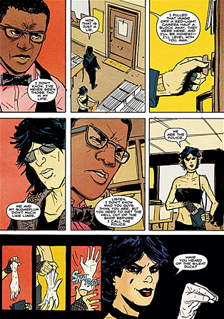 Pires and Copland cover a lot of ground in this issue. We get a look at Spike’s bosses, the Joey Ramone and Pat Benatar assassins close in on their quarry and Elle goes on a drug-fueled vision quest during a chase scene.
Pires and Copland’s disgust for the pre-packaged pop biz has bite. There is a scene in the book where Spike’s bosses call him to check on his progress. Pires’ art and Pete Toms’ colors portray the Hollywood Fat Cats as corpulent corporate scum. They have garbage lingering on the sides of their mouths. The main guy has an oxygen tank next to him. The execs are reminiscent of Chaucer’s Canterbury-bound Monk – just loud, large and gross. The visual also reminds me of Dark Knight Returns-era Frank Miller.
That’s the thing I really like about this book: it’s angry, but not at the expense of the funny. The storytelling in the issue’s final chase scene is intense. As Elle smokes some DMT (courtesy of Coop) by a lake, a chase scene in the real world ensues. Pires and Copland jump between Elle’s vision, and Coop’s desperate attempt to evade their pursuers feels like a blend of Alejandro Jodorowsky and Jordi Bernet.
Pop #2 ups the weird and it’s an absolute blast! It should be at the top of your reading pile, Dear Reader.
Full disclosure: Dark Horse Comics provided Unwinnable with an advanced review PDF of Pop #2. It hits store shelves today.
———
Society of Superheroes: Conquerors from the Counter World #1
 (DC – writer: Grant Morrison; artist: Chris Sprouse)
Usually, when I read a Grant Morrison comic, I expect some of it to go over my head. Okay, a lot of it. But Society of Superheroes is a pretty straightforward tale that borrows heavily from Flash Gordon-type action – a mixture of science fiction and pulp – that all boils down to create a comic that is still a bit over my head at times, but wholly enjoyable and fun to read.
The story, a compact and action-heavy tale, follows Doctor Fate and the Society of Superheroes, a group who gathers in the face of an imminent attack from an enemy living in a parallel universe. The comic has all the grandness of an Indiana Jones movie, involving air battles, monsters and some swashbuckling as well. Morrison’s story clips along at a frantic pace, but the thread of the narrative never loses its cohesion. He shifts between scenes with ease, masterfully pacing the comic up to its cryptic yet foreboding conclusion.
The comic also has all the elements of a pulp story: a dashing hero, strong women, exotic locales, grand battles and a fight eons in the making. Everything about the comic is aimed at paying homage to the epic nature of serial films like Buck Rogers and Flash Gordon. Morrison’s love of the genre is so palpable that it comes through in the grandness of the comic. There’s still the usual Morrison plot mysteries and references to comics as a cursed art form (like those seen in The Multiversity #1), but the story reads more cohesively than some of his other works.
Additionally, Society of Superheroes features Chris Sprouse’s gorgeous art. Sprouse captures the romantic hue of Morrison’s story, capitalizing on the tonal intent of the comic and illustrating page after page of intricately detailed art. Sprouse has a cinematic eye and impeccable timing. Some of the comic’s best moments – be they action or humor – land soundly due to Sprouse’s illustrations. One such panel, of Doctor Fate kicking Doctor Faust in the crotch, is hilarious in its imagery and execution.
But every page of the comic is just as gorgeous. Karl Story and Walden Wong provide lush, sharp inks, and Dave McCaig matches the majestic scope of the comic with his flashy colors and glossy hues. Everything about this book makes it a must own for comic fans. It’s a delightful trip inside the mind of one of comics’ most enigmatic creators and truly a pleasure to read.
———
Daredevil #8
 (Marvel – writer: Mark Waid; artist: Chris Samnee)
As a series, Daredevil has been a lot of things: serious, funny, heartwarming, exciting, tense, action-packed and enjoyable.
I would not have thought to add “creepy” to that list.
The latest issue of Daredevil, however, strays into eerie and dark waters. A story involving Purple Man, a villain with the ability to control people’s actions through verbal suggestions, plus his legion of brainwashed children, takes the comic in a chilling and sinister direction.
The opening of the comic is akin to a scene in ‘Salem’s Lot when Danny Glick returns to his friend Mark Petrie’s house, scratching at the window and begging to be let in. Waid nails the tone of the comic so that readers have no doubt that the Man Without Fear is going to be face-to-face with a new breed of it soon.
Waid offsets the spooky opening and closing of the comic with a story involving Matt and Karen Duffy visiting Karen’s father. The aside is mostly spent on building the character relationships, and Waid definitely lightens the load in these moments. Matt and Karen are adorable as a couple, and their relationship is one of the most realistic I’ve ever read. Waid has a great handle on the comedic timing, and the back and forth between the characters is buoyant but not overly clever.
Everything is grounded in giving the comic a sense of realism, and despite the obvious fantastic leap readers have to take whenever they read a comic book, Waid offsets the incredible with the worldly – but in a way that makes readers care. Not many writers spend issues of Batman showing Bruce at fundraisers and going to galas because they’re not as interesting as seeing him battling villains. Waid has found a happy medium between Matt’s life as a lawyer and Matt’s life as Daredevil, and both are equally as engaging.
Plus, a lot of credit needs to go to Chris Samnee, who crafts frightening imagery in the more serious moments of the comic. The final pages, where Zebediah Killgrave confronts the children he’s controlling, bring the comic full circle to its terrifying introduction. And this kind of style shows that while Samnee can raise Daredevil to an uplifting and humorous level, he can also drag it down into some dark areas with little more than some skillful shading and grim coloring.
Daredevil is one of my monthly must haves, and readers of the series know why. Waid and Samnee have delivered a consistent level of excellent stories, both in their writing and their visuals. Even in making a move as bold as having Matt travel across the country, the creative team has found a way to keep the series consistently fresh and entertaining.
———
Edge of Spider-Verse #2
 (Marvel – writer: Jason Latour; artist: Robbi Rodriguez)
Comic book character Gwen Stacy is most famous for two things: being Spider-Man’s first girlfriend, and dying. Not so in Edge of Spider-Verse #2, or, as it’s more commonly known, The One Where Gwen Stacy is Spider-Woman.
Set in an alternate universe where Gwen Stacy is the one bitten by a radioactive spider and Peter Parker the one who dies in the hero’s arms, Edge of Spider-Verse #2 follows Gwen as she prowls the roofs of New York City as its Spider-Woman.
Peter’s death becomes a sort of Uncle Ben moment for Gwen; at the start of the issue her grief and guilt are evident. It also becomes the reason why the New York City police and the Daily Bugle are after her: both blame Spider-Woman for Peter Parker’s murder.
With its bright, solid colors, thin black lines, minimal shadow and sound effects rendered as neon-colored, all-caps “THUMP”s and “WABOOFF”s, Edge of Spider-Verse #2 creates an art style that blends the dynamism of contemporary comic art styles with a fun classic look. Characters all have similar, stylized faces with small oval-shaped eyes and angular chins. Sometimes I found this distracting, as it gave the characters blank, robotic expressions.
But the art’s greatest strength is in its character design. Gwen has one of the coolest costumes that I’ve ever seen on a lady superhero. It’s not just the hood or the subtle red-and-blue “classic” accents. Gwen’s costume is designed top-to-toe to emphasize her strength, not her sexiness – and where it’s sexy, it’s sexy because it’s strong, as with the white-on-black slashes that frame her hips. The costume also has a black V-shape on the front that, depending on the angle, at times accentuates Gwen’s chest and at other times de-accentuates it. A perfect compromise of physical beauty and physical strength, in my opinion.
Edge of Spider-Verse #2 stands alone as a fun, interesting story, without requiring people to read issue #1 or even to be too familiar with Spider-Man mythology in general.
The issue’s bad guy does tie in with the larger overarching plot of the Edge of Spider-Verse miniseries, but despite not having read #1 I had no trouble understanding #2.
That’s because Gwen doesn’t know about the Edge of Spider-Verse plot, either; for her, the bad guy is yet another challenge to balancing her social life, family life and superheroics. And in true Spider-style, by the end of the issue Gwen has only succeeded at the latter.
A note at the issue’s end says that Gwen Stacy’s Spider-Woman will appear again in the Edge of Spider-Verse story arc. I already can’t wait.