Last Week’s Comics 2/6/2013
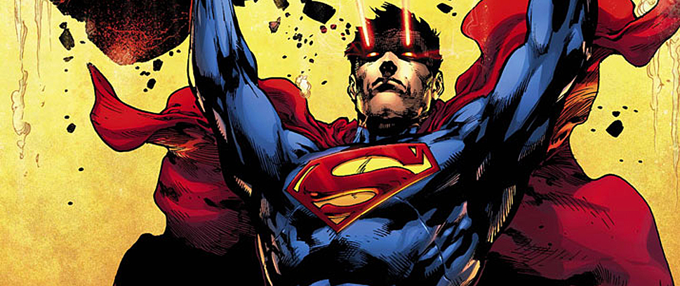
Superman #16
(DC – writer: Scott Lobdell; art: Kenneth Rocafort)
Lately, reading Superman is an exercise in patience. Much of Scott Lobdell’s work irks me more than anything – I have not enjoyed either Teen Titans or Red Hood and the Outlaws – and his unorthodox, light-hearted style doesn’t mesh well with my fierce love of the written word.
 In Superman #16, however, he shows the kind of writer he could be and the kind of work he could produce – if he could only get out of his own way.
Lobdell is currently in the middle of an arc entitled “H’El on Earth,” based on a premise that another Kryptonian exists and he’s “H’El” bent on erasing Krypton’s explosion from the time stream, saving his family and past in the process. The story is not great, but this issue has sparks of artistry. H’El’s narrative thread is well constructed, and immediately engaging. When Superman and the Justice League storm the Fortress of Solitude, Lobdell writes a few great action and character moments.
Then the other shoe dropped.
In an effort to keep readers in tune with every character, Lobdell gives descriptive narration boxes to explain a bit about the character and the role he/she plays in the story. These, however, are a chore to read, lack the same deft panache as the rest of the story and really throw what starts as an interesting comic right off the rails. The comic also has a few jarring shifts in scenery that detract from the pace, forcing me to have to flip back and forth to make sure I wasn’t missing a page of the comic.
Kenneth Rocafort, for his part, has some great heroic shots of the major players. Some of his distance shots alter the faces and body designs of certain characters making for an uneven style, but these don’t occur very often and when given the chance to really focus on one person, Rocafort shines. He handles chaos well and even in panels packed with monsters or flashes of light, Rocafort keeps the imagery clean and lucid.
I don’t like being so negative about Scott Lobdell. After all, he’s only one cog in the big DC wheel, and the guy’s writing Superman for Rao’s sake! I just so desperately want to love Superman again and when I see flashes of what could be, my frustration only becomes more palpable.
To paraphrase Thoreau, “Simplify, simplify, simplify.” Make the story a simple tale about a man who can fly and everything else should fall into place. It worked with Tom De Haven and it can work again for DC.
———
Superior Spider-Man #2
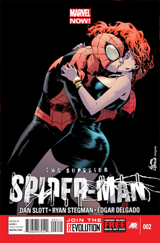 (Marvel – writer: Dan Slott; art: Ryan Stegman)
I loved Dan Slott’s epic Amazing Spider-Man #700, and I thought Superior Spider-Man #1 was a great way to mesh the major changes in Spidey’s life with the new direction introduced by the writer. But this issue lacks the same luster as the previous one and while Slott is trying to find a way to balance both Otto and Peter in Spider-Man’s body, the gimmick becomes tedious as we’re never really given an opportunity to see Otto living in Peter’s skin.
To be fair, Slott very effectively closes the door on a possible Mary Jane/Otto Octavious (as Spider-Man) love story. And that’s really what this comic is about – the timeless love between Peter and Mary Jane, despite Otto’s attempts to move in on her. Otto’s approach is not very effective either as he’s not used to courting women, so watching him fail at his game is pretty funny.
Slott also uses the consciousness of Peter Parker (represented by a visible, omnipresent ghost) as a reactive voice, commenting on everything Otto does. After a while, though, it just gets tiresome. Peter has a few humorous moments, but I want to experience Ock’s failure’s for myself, without guidance from a spectral narrator.
Ryan Stegman’s work is really the highlight of the issue. He’s great at depicting both action and exposition – and facial features in particular really benefit from his cartoony, yet clean style. Some of the tight shots give the emotions of the moment more weight and Stegman’s lithe, angular Spider-Man is one of the best designed in years. Props also go to Edgar Delgado for the liveliness he brings to the comic with his excellent use of colors, particularly in when Otto delves into Peter’s memories to see some of his more intimate moments with Mary Jane. What Otto does after that, however, is just gross.
I know Slott was anxious to show readers that Peter has a way back in, but he may have played his hand too quickly. If we’re every going to know how Otto is a “superior” Spider-Man, we need to give him time to show us. Instead, we’ll have to watch as Peter’s consciousness slowly worms its way back into his body until the inevitable day when he’s no longer Superior, but everyone’s beloved Amazing Spider-man.
———
Batman and Robin Annual #1
 (DC – writer: Peter J. Tomasi; art: Adrian Syaf)
Bannen’s Book of the Week: If I’m going to review this book as my pick of the week, I need to get my critiques out of the way first. This is not a great annual in the sense that it redefines the character, introduces groundbreaking new information or makes powerful use of its current line up of characters. No, Batman and Robin annual goes on for too long, borders on saccharine, and fails to really execute its main purpose.
But it’s a hell of a fun book to read for one reason in particular: Damian Wayne.
Remember Home Alone? Imagine that same concept, except you have access to all of Batman’s vehicles and gadgets. And you think you’re better than him. With Bruce out of town, Damian straps on his own cowl, slips on his own Bat Suit and paints the town red with blood in a comic that is hilarious, cleverly penned (for the most part) and extremely entertaining.
The parts of the book that don’t work are those that follow Bruce as he jaunts around the world, chasing down riddles from Damian that show Bruce touching moments of his parents’ lives. Bruce’s banter with Alfred, in particular, is more comedic than clever and seeing Alfred throwing a temper tantrum while storming out of a stage production is not my idea of a well written story.
Damian running loose in Gotham, however, is more than enough to keep the comic afloat. Tomasi plays with a lot of Batman’s major characteristics – the disguised voice, the ability to appear and disappear on a whim – but adds a Damian flare to them. He writes Damian so well that the kid’s persona pervades every page of the issue, and seeing him in full costume, albeit several feet shorter than his father, is every bit as impressive and frightening as Bruce in a rage.
And really Adrian Sayf deserves full credit for this. Sayf brings Damian to life with his lucid and detailed illustrations. Every moment involving Bruce’s son fighting crime is so well executed that the action heavy scenes fail to lose any of their clarity, regardless of the chaos being depicted. One splash page in particular, a montage of all of Damian’s heroic and violent acts, is a piece of art and I would seriously consider searching out the original to hang on my wall.
Lastly, the annual delivers in that it gives readers a different view point, shows them something unique and amusing, and leaves a lasting impression after the final page is turned. Despite its flaws, Batman and Robin annual is a comic that you should read, if only to see how well an eight year old can fill Batman’s big shoes.