Last Week’s Comics 9/12/2012
Green Lantern #0
(DC – writer: Geoff Johns; art: Doug Mahnke)
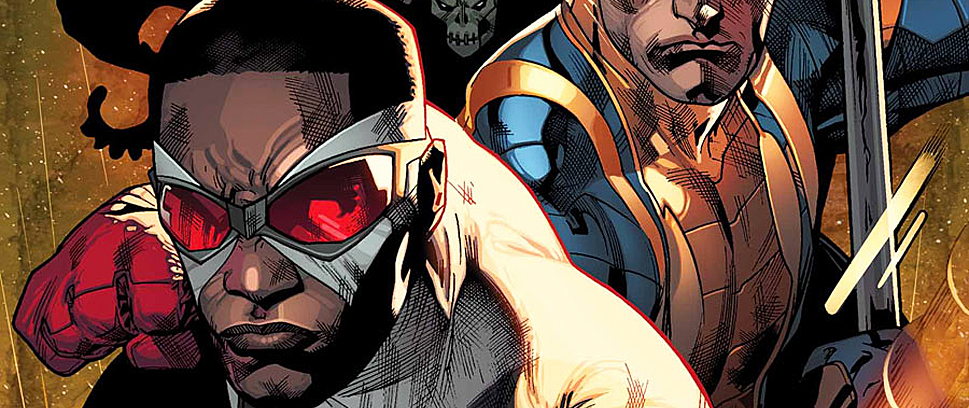
We got ourselves a new Green Lantern! After the pretty stunning events of Green Lantern Annual, Geoff Johns introduces the new guy who will don a ring and fly around space in a glowing willpower suit. The idea of expanding the character into different modalities resonates, not only because of its potential market appeal, but also because our society is becoming increasingly diverse. So why not have an Arabic Lantern?
 Regardless of Johns’ impetus for creating Simon Baz, the story is just too compressed for the character to fully develop. Given that he’s trying to get all his ducks in a row in issue #0, Johns pushes the story of an Arabic man who, after 9/11, is dogged by bullies and hounded by police due to his cultural background. Baz still has a lot of mystery about him, and he does have the qualities of a hero (especially the ability to overcome fear), but the story feels truncated given the goal of putting a ring on Baz’s finger by the final page.
Doug Mahnke, however, churns out some of his best stuff to date. His detailed illustrations perfectly capture mood and emotion, and he knows when to go for tight facial shots to show heavy feeling. After Baz is detained for his role in a terrorist act, Mahnke brings the character to life, conveying his sadness, frustration and confusion. While Ethan Van Sciver was a welcome return in Green Lantern Annual, I have high hopes for Baz’s future under Doug Mahnke’s talented pen.
I’m intrigued by the ideas Johns leaves us with, namely how Baz was chosen as a Green Lantern. Also, where the hell are Hal Jordan and Thaal Sinestro? These are the heavy mysteries that will probably be focal points in “Rise of the Third Army,” but I’d like to see Baz in a more prominent role and with more room to develop. I know this will happen over time, but for an introduction, Green Lantern #0 fails to give its character a strong first impression.
———
Before Watchmen: Silk Spectre
 (DC – writers: Darwyn Cooke and Amanda Conner; art: Amanda Conner)
When we last left Laurie, she was in the midst of a Bond-esque conspiracy that was using drugs to make teenagers become slaves of a capitalist regime. The silliness of the idea dampened what was initially a great read and made me a bit concerned about the future of the series. This issue, however, is a welcome follow-up that is character driven, action heavy and fantastically illustrated.
The first six pages of the comic follow Laurie Juspeczyk as she works her way through an acid trip. Here, Amanda Conner’s artistic abilities are on full display. Her panel construction, trippy styling and skewed imagery really take you into Sally’s mind. The rest of the comic is a stellar read as Laurie deals with not only her boyfriend’s accidental overdose, but her mother sending a “friend” out to find her. I won’t give it away, but I’m pretty sure you could guess who shows up.
And it’s awesome.
Lastly, while Laurie didn’t do much fighting in the original Watchmen, Cooke and Conner seem intent on showing that she’s more than just a pretty face in a revealing costume. The page construction is similar to Watchmen in its moment-by-moment focus, and many pages, like the original, are a full nine panels. This allows the story to gain momentum and flow smoothly from scene to scene. It also helps with tension, action and pacing.
If Matt Fraction’s Hawkeye wasn’t so damn good, this would have been my pick of the week. It’s funny, visually engaging and well written. As it moves more and more into the Watchmen mythos, the connections are starting to become clearer, which makes me a little nervous because the story is good enough on its own. Still, there’s an originality to the work, even though it’s based on the most well-known graphic novel in comics history.
———
Hawkeye #2
 (Marvel – writer: Matt Fraction; art: David Aja)
Bannen’s Book of the Week: Here’s where I tell you to go out and buy this book.
Matt Fraction outdoes himself in the second issue of his archer series, as he tells a story about a circus of thieves (literally) and Clint’s attempt to take them down. The comic is frequently funny and word-heavy, but awesomely paced and rapid-fire in its storytelling. Panel-full pages move with a rhythmic clip that never loses momentum and even in the midst of the chaos, the comic is crystal clear in its storytelling.
Fraction’s writing is good, but with David Aja’s artistic style, the comic vaults itself into an upper echelon. Aja throws in stark black and white panels for effect, but does so in appropriate moments so the imagery resonates. Given the amount of action Aja has to draw, the flow of the story is never impeded. Even in the story’s most intense scenes, Aja breaks up the panel flow in order to keep simultaneous moments separate until they need to come together.
Colorist Matt Hollingsworth and letterer Chris Eliopoulos deserve nods here as well, due to the quick color shifts that help untangle the story. Where some panels are visually compact, Eliopoulos finds a way to put the dialogue or narration in without impeding the story.
Find your way to the comic shop and pick up Hawkeye. Beyond being a fun read, both narratively and visually, it’s an exercise in writing and drawing an excellent comic book. People who bash comics as colorful stories haven’t read books like this. Maybe they shouldn’t. It keeps the mystery alive.


