Last Week’s Comics 5/9/2012
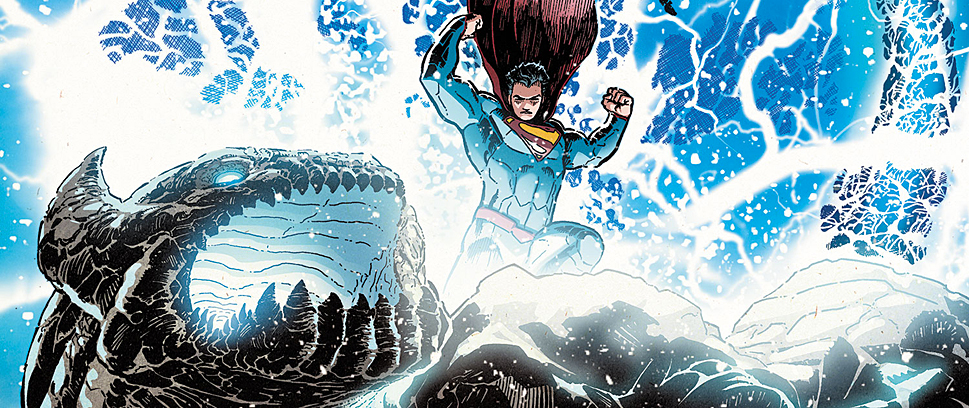
Action Comics #9
(DC – writer: Grant Morrison; art: Gene Ha)
Whenever I read a Grant Morrison comic lately, I feel like the only person who would understand it is Grant Morrison. While I liked the change in story to a different Earth, I don’t understand why Morrison switched to this, nor how it fits into the regular continuity. And honestly, I probably never will.
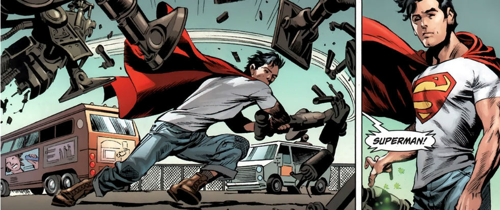
Morrison’s Earth-23 Superman is a black president who has to split his time between running the country and saving the world as a superhero. Even writing this description makes me cringe. Named Cal Ellis in this Earth, President Superman still battles the evil Lex Luthor, yet he uses robots to take his place in the Oval Office (I’m not kidding). Much of the story, however, is concerned with alternate versions of Lois, Jimmy and Clark, who come up with an idea for a hero, but it’s quickly taken by a soulless corporation and used as a means to control the populace.
 The story is weird but fun to read. Morrison is able to create a new origin, new character and a new world, all of which are as developed as the world readers already know. Without the baggage associated with Superman, Morrison has free rein to make any major changes he wants. It’s freeing to read, and as a reader, I could see that Morrison was having fun. The comic still suffers from the usual Morrison work – frantic shifts in place and quick jumps in scenery that at times make for a confusing read – but the heart is still there, as is the metacognitive hand of the author.
In the issue, Gene Ha’s art reminds me of Bill Watterson’s Calvin and Hobbes comic strips. Whenever Watterson depicted realistic characters, he used thick outlines and heavily-shaded illustrations. Many of Ha’s characters look like they belong in one of Watterson’s comics. This isn’t a complaint, because I really enjoyed Ha’s drawings and Art Lyon’s vibrant candy colors. But the times when Ha goes for simplicity, those drawings that are almost lacking color (and the one panel that is only black and white) are when the art is really on display, and it’s these illustrations that I most enjoyed.
Besides Morrison’s crazy pacing, I want to see more of Earth-23. I like that DC is opening doors to the multiverse, and while I could do without the overtly political messages in this issue, I like this rendering of Superman more than the one Morrison has written about in previous issues. But for an issue that feels more like an aside than anything else, I don’t see the need for it, nor how it fits into the current Action Comics arc. Then again, it is Grant Morrison writing it, so I probably will never understand it.
———
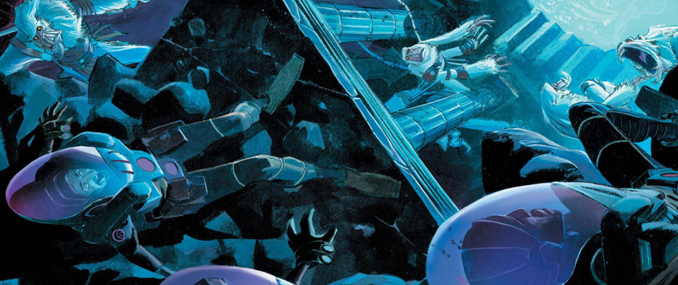
Dial H #1
 (DC – writer: China Miéville; art: Mateus Santolouco)
Based on a House of Mystery series that eventually became its own title, Dial H is the story of a man who can dial the word “hero” and become a superhero for a short time – yet every time he dials “hero,” he changes costumes and powers. As part of DC’s New 52, Dial H is meant to reintroduce a series that has gone through several iterations. A comic that could possibly be one of DC’s most unique, Dial H is an odd mix of visually-disturbing art and erratic, yet unique, storytelling.
Dial H’s main character, Nelse, is an overweight former boxer who, while trying to call the police, ends up using a rotary phone that turns him into a spindly, smoking vigilante. The idea behind the comic is odd, but that helps with the story. At times, China Miéville’s pacing loses its fluidity, and much like a Grant Morrison story, makes leaps in its structure that disrupt the flow. For example. Nelse’s fight with an unnamed gangster is broken up by a random dead woman. The wackiness of the story doesn’t make the moment feel out of place, but the lack of explanation makes for an even more cryptic comic.
But where Miéville’s story is trippy enough, Mateus Santolouco’s art is even trippier. The first hero Nelse turns into is a Jack Skellington-like character who exists as cigarette smoke. Drawn consistently out of frame and misshapen, the hero is a disturbing visual for new readers. Even later in the story when Nelse becomes Captain Lachrymose, the character is still angular and strangely out of focus. The lanky and pointed nature of the design is reminiscent of a Jae Lee illustration, but with Tanya and Richard Horie’s colors, the characters have much more detail and don’t appear as opaquely shaded people. Miéville is best at drawing at a distance, however, because his character’s faces up close look misshapen and asymmetrical.
For such an odd story, however, Dial H was pretty interesting. I hope Miéville can keep the character engaging and give Santolouco a lot to draw, because his designs make the hero Nelse changes into the most engaging part of the book. In the wake of their character revamp, I think Dial H is a smart choice for DC. Its quirkiness offers a different side to the superhero genre, and its originality easily separates the book from the rest of the pack.
———
The Spider #1
 (Dynamite – writer: David Liss; art: Colton Worley)
Bannen’s Book of the Week: Dynamite continues its noir kick with The Spider, a violent tale of an antihero who plays by his own rules and kills indiscriminately. But much like The Shadow, The Spider is a fun read and an issue that captures the feel of noir and pulp fiction.
For writing a story about a guy who dresses up in a costume covered with spider webs, David Liss spends the majority of his time introducing and developing Richard Wentworth. In fact, the moments with the Spider feel like transition pieces rather than the heart of the story. His interactions with his ex-girlfriend, Nita Van Sloan, are the true heart of the story. Richard’s bound to duty, yet he can’t ignore his feelings for Nita. This may come off as corny, but it isn’t. Their moments together add elements of humanity that are desperately needed if readers are going to identify with such a violent main character. Also, people seem to know that Wentworth is the Spider, yet they can’t prove it, and this makes for some great conflicts. Liss’ Wentworth is levelheaded and cocky, yet he plays off the suspicions in ways that don’t come off as desperate. While he doesn’t want people to know he’s the Spider, at the same time I don’t think he’d care if they found out.
While I enjoyed the story, I didn’t really like Colton Worley’s art. Its photorealism works at times but looks silly at others (particularly when characters are depicted up close). Facial expressions border on being comic. Like a cleaner Alex Maleev, Worley’s characters look like photographs rendered as comic strips. I would have preferred grittier illustrations, given the nature of the story. The scenes with the Spider are great; the ones between Wentworth and Nita Van Sloan, however, are visually distracting.
I still enjoyed the comic, and maybe it’s my love of pulp, but David Liss captures the tone perfectly. Readers are thrust into a grimy world full of evil and violence. The Spider is a hero who uses a pair of .45s to dole out justice, and I loved every second of his attacks. The story is taking a turn towards horror, but that makes it all the more interesting. I’m looking forward to seeing more of The Spider, and more of the noir world that Dynamite has resurrected.